TABLE OF CONTENTS
- What is the Double Top Pattern?
- How to Identify the Double Top Pattern
- Trading Guide with the Double Top Pattern
- In-Depth Analysis of the Double Top Pattern
- Contrasting Viewpoints on the Double Top Pattern
- Using Other Technical Tools to Confirm the Pattern
- Real-World Example: The Double Top Pattern and a Bearish Market
The Double Top pattern appears in an uptrend, signaling a reversal into a downtrend.
What is the Double Top Pattern?
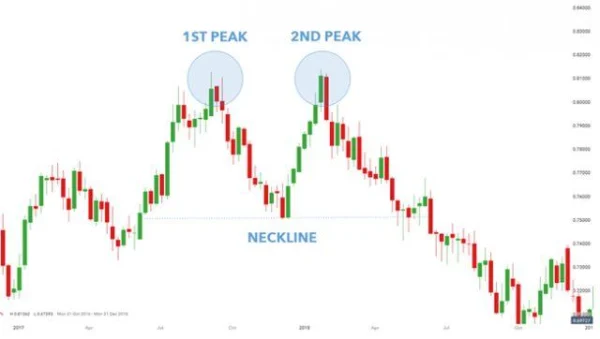
The Double Top pattern signals an impending price decline. After reaching the first peak, the market experiences a correction and then recovers; however, the uptrend weakens and is unable to surpass the first peak.
Although not mandatory, the market may briefly exceed the first peak (even if just for a short time). A slight and temporary breakout above the first peak may trigger the selling side to reverse the trend. The neckline is formed at the lowest point between the two peaks. A break below this neckline will confirm the Double Top pattern.

How to Identify the Double Top Pattern
To identify the Double Top pattern, follow these steps:
- Identify two peaks that are at or near the same price level.
- The distance between the peaks should not be too short – this depends on the time frame you are analyzing.
- Confirm the neckline/support level, which is crucial for validating the pattern.
- Use additional technical indicators to support the bearish signal (such as moving averages) to increase accuracy.
Trading Guide with the Double Top Pattern
1. Trading with the Double Top Pattern
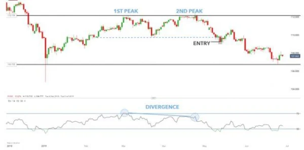
In the weekly USD/JPY chart, the Double Top pattern forms after the preceding uptrend, with the first peak reaching a resistance level (combined with an overbought signal from RSI). After this peak, the market starts to lose strength. The second peak forms slightly higher than the first peak and even briefly breaks above the resistance. Interestingly, the RSI does not show an overbought signal (as marked). The divergence between the market price and the RSI indicator signals a bearish move.

The entry point is confirmed when the price closes below the neckline (marked on the chart). The resistance connecting the two peaks can be used as a stop-loss level (neckline/dotted line).
2. Double Top Pattern on the Ryanair Holdings PLC (LSE) Chart
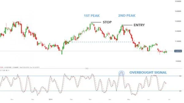
The Ryanair Holdings PLC (LSE) stock chart shows a completed Double Top pattern. Using momentum indicators allows traders to enter a trade after the second peak forms, taking advantage of the stock’s downward trend. The stop-loss is placed at the first peak.

In-Depth Analysis of the Double Top Pattern
The Double Top pattern is truly powerful in signaling reversals, but identifying them accurately is not easy. This pattern typically forms after a prolonged uptrend, and it’s important to note that a break below the neckline does not always result in a clear reversal.
A real example from the global stock market can be seen in Apple stock in 2022. Apple (AAPL) had a clear Double Top pattern after the price peaked at $175 in January 2022. The second peak was formed near the same level, $174, in March 2022. When the price broke below the neckline at $150, the Double Top pattern was officially confirmed. However, interestingly, the stock continued to decline, but then quickly reversed and surpassed the previous peak. This is an example of the uncertainty the market can bring, where the pattern didn’t play out as initially expected.
In this case, if traders had relied solely on the Double Top pattern without combining it with other indicators like RSI or MACD, they could have fallen into a trap and missed the market’s potential. This is why understanding the combination of technical analysis tools is incredibly important.
Contrasting Viewpoints on the Double Top Pattern
Some investors hold a contrasting view when evaluating the Double Top pattern. They believe that, in certain cases, this pattern does not necessarily lead to an immediate reversal into a downtrend, but may simply represent a pause in a strong uptrend. Some experts assert that when the market is exceptionally strong, as in the case of Amazon or Tesla in recent years, the Double Top pattern may just be a “break” before the market continues its strong upward trend.
For example, Tesla (TSLA) stock between 2020 and 2021 saw several instances of the Double Top pattern amidst a strong uptrend. However, these patterns were simply pauses in the uptrend, and after that, the stock went on to make new higher peaks.
One reason why the Double Top pattern is sometimes dismissed is due to significant volatility and external market factors. In the case of Tesla, news related to technological innovations, strong quarterly profits, or interest from major investors could make this pattern seem like a temporary occurrence.
Using Other Technical Tools to Confirm the Pattern
DLMvn always emphasizes that if you want to use the Double Top pattern effectively, combining it with other indicators is extremely important. This pattern can help you identify potential trading opportunities, but relying solely on it without confirmation from additional tools can lead to serious mistakes.
A typical example is using the RSI (Relative Strength Index) to confirm the Double Top pattern. If the RSI shows divergence (when the price continues to make new peaks but the RSI fails to surpass the previous peak), it could signal weakening momentum in the uptrend and a potential reversal. RSI is a popular tool to help traders identify overbought or oversold conditions, and when combined with the Double Top pattern, it can provide highly accurate signals.
Additionally, using MACD (Moving Average Convergence Divergence) is also an excellent option. MACD can help you spot divergence between the price and moving averages, allowing for more informed trading decisions. In the case of the Double Top pattern, if MACD gives a strong sell signal, it is a warning that a downtrend might be forming.
Real-World Example: The Double Top Pattern and a Bearish Market
There have been periods in the history of the stock market where the Double Top pattern has demonstrated remarkable strength in confirming a downtrend. One notable example is the global financial crisis in 2008, when the S&P 500 formed a Double Top pattern before officially entering a prolonged recession. The Double Top pattern appeared at the 1576 level in October 2007, after which the market sharply declined throughout 2008, bottoming out in March 2009.
Confirming the Double Top pattern through technical indicators such as the Stochastic Oscillator or Bollinger Bands in this case helped traders exit the market in time, avoiding significant losses.
However, some investors failed to accurately identify the Double Top pattern and continued to buy during this period. They believed the market would rebound immediately, but in reality, they witnessed a significant decline afterward. This is an important lesson: relying on just one pattern without combining it with additional factors increases risk.

DLMvn > Trading Indicators > Trade Smarter with the Double Top Chart Pattern
Expand Your Knowledge in This Area
Trading Indicators
Mastering the Morning Star Candlestick to Conquer the Market
Trading Indicators
Inside Bar: A Powerful Candlestick Pattern for Identifying Entry Points
Trading Indicators
Head And Shoulders Pattern: How To Identify Reversal Signals
Trading Indicators
Mastering the Market with the Evening Star Candlestick Pattern
GlossaryTrading Indicators
Moving Averages – A Comprehensive Overview
GlossaryTrading Indicators
Stochastic Oscillator: An Effective Tool For Forecasting Market Trends